


|
|
This poster describes a study conducted by the Human Interface Design department at Fidelity Investments Systems Company. The purpose of this study was to obtain performance and preference data about various methods of displaying data definitions in online help. The four methods studied were an alphabetical list of data elements with pop-up definitions, a window-ordered list with pop-up definitions, a screen shot of the window with pop-up definitions, and a table listing all data elements and their definitions. Performance and preference data indicated that the alphabetical list was the best.
Online help, information design, reference topic
© 1997 Copyright on this material is held by the authors.
One function of the Human Interface Design department at Fidelity Investments Systems Company is to develop online help systems for Windows applications developed in-house. Our experience has been that most development organizations within Fidelity feel that context-sensitivity at the individual control level is labor-intensive to implement. However, they are willing to link help to the application at the window level, accessible via the F1 key. Therefore, since the user must always see a "window-level" topic first, we try to make field-level information as easily accessible from that topic as we can. Our method of doing this is to display a "reference topic" when the user presses the F1 key. Reference topics provide the following information for the active window:
The method we use to display the data definitions is the subject of this study. In the past, we have created screen shots of each window that the user can click on to display pop-up definitions. While this method provides the advantage of a visual correspondence between the window and the location of the definition, we also saw the following disadvantages:
Because of these disadvantages, we decided to explore alternative display methods for this information.
The study consisted of an online help system and an application. Time, accuracy, and preference data were recorded for each participant.
We examined four methods of presenting data definitions within our reference topics:
Context-sensitive help links were implemented between the online help and the application.
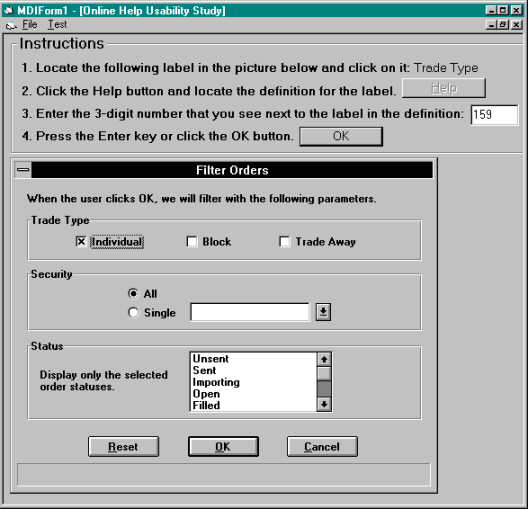
The application was developed using Visual Basic, and consisted of an instruction area and a display area, as shown in Figure 1. The instruction area told the participants what to do. The display area showed pictures of windows, one at a time. The window samples were from applications currently in use at Fidelity, and ranged from visually simple to more complex. For each of the four display methods being studied, we created ten search tasks, for a total of 40 for each participant. A "search task" consisted of these steps:
The order in which the four display methods were presented to the participants was varied to eliminate any "fatigue" or practice effects.
The application windows, and consequently the help file topics, varied in size from 9 to 56 data fields. This allowed us to determine whether window size has an effect on the ease of accessing field definitions.
Twenty participants were tested. The participants chosen for this study were employees of Fidelity Investments who are familiar with Windows-based applications and Windows Help systems. This targeted audience closely reflected the user population of the online help systems that we develop.
Three types of data were submitted to analysis: search time, accuracy, and subjective preference. A within-subjects analysis of variance was conducted for each measure. There were no significant differences in accuracy across the display methods.
Analysis of the time data, as shown in Figure 2, revealed a significant main effect of display method, F(3,57) = 4.28, p < .01. There was also a significant main effect of window size, F(9,171) = 18.98, p < .01, with larger windows yielding longer search times. In addition, the interaction between display method and window size was significant, F(27,513) = 2.578, p < .01, with "Window Order" and "Table" being most affected by size. Post-hoc comparisons of means revealed that "Alpha Order" was significantly faster than "Graphic" and "Table."

Figure 2. Average search times by display method and window size. ("Small" means less than 20 fields.)
Preference data was captured via a rating scale of 1-4 (higher = worse) that the user completed after the online portion of the study. Analysis of the ratings, as shown in Figure 3, revealed a significant main effect of display method, F(3,57) = 13.93, p < .01. Post-hoc comparisons of means revealed that "Alpha Order" and "Graphic" were more preferred than "Window Order" and "Table."

Figure 3. Average preference ratings by display method.
Looking at the time data and the preference data together, the best choice is clearly the "Alpha Order" method, which is the only one that was in the "best" group for both measures. That is the approach we are now using.
|
|