


|
|
Department of Electrical Engineering,
Imperial College of Science, Technology and Medicine
South Kensington , London, SW7 2BT
Tel: +44 171 594 6261
l.tweedie@ic.ac.uk
http://www.ee.ic.ac.uk/research/information/www/lisat.html
In the late sixties, Simon [37] noted that "An early step towards understanding any set of phenomena is ... to develop a taxonomy. This step has not yet been taken with respect to representations. We only have a sketchy and incomplete knowledge of the different ways in which problems can be represented and much less knowledge of the significance of the differences".
Taxonomies of static representations have now been developed [6, 36, 50]. On the input side, Card et al [9] have also classified the design space of input devices. Ahlberg and Truve [1] have extended this work to outline the design space of query devices. The value of such abstractions is that they discard "irrelevant details while isolating and emphasizing those properties of artifacts and situations that are most significant for design" [8].
This paper is a first step in the characterization of interactive externalizations. It considers three aspects of externalisations: Firstly the underlying data used to create the representation, secondly the forms of interactivity available to the user and thirdly the input and output information that is explicitly represented by the externalisation. Fourteen examples of interactive visualizations are examined in relation to these aspects. Two of these visualizations are then described in more detail from a data-centric perspective. Taken as a whole these characterization methods enable potential designs to be evaluated and different techniques compared.
Casner [11] identifies that "Different presentations of the same information best support different tasks". In other words, each question that a user wants to ask requires an entirely different presentation. Whilst this limitation applies to static presentations, it is not relevant when interactivity allows different features of the data to be made salient as and when required. Here, the underlying representation becomes a medium through which different features of the data are made explicit. A single representation can now be used to answer many different questions.

Figure 1: Types of Information Represented
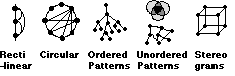
Figure 2: Five types of Structural representation
For instance we may have a data set but not know the structural relations within it. Derived structure about a set of data values can be obtained from calculations across the whole data set. This has been particularly popular in the field of information retrieval where the structure of a set of documents is often not well understood (e.g. Bead [12] described in example E).
We may have a good understanding of the structural relations within our problem e.g. a full set of mathematical equations (a model). However such models are often not very easy to understand in algebraic form. Instantiating such models with a set of data values and calculating the resulting outputs can create derived values which can be visualized [27, 44, 49].
Much of the interactivity in the visualization tools developed to over the last decade can be described as making use of direct manipulation (DM). In other words a literal replication of physical behavior in the real world. This can be direct in the sense of manually moving an object (Figure 3) or based on a tool metaphor (mechanized). However the key is that it is "literal" so that users can easily understand how it should behave based on their knowledge of the real world.
However, as Smith [39] has identified the computer provides many opportunities to add more "magical" functionality which does not rely on direct physical metaphors. More recent information visualizations have started to make use of this Indirect manipulation (IM). For instance, Smets et al [38] provide designers with "magical" tools that stretch and deform an object in a virtual reality environment. The tools "do not merely mimic everyday ones; instead they offer new behaviors to designers". The examples that follow will attempt to clarify the value of indirect manipulation further.

Figure 3: Balance of Control at the Interface [32, 27]
The importance of mutual reference between input and output information was outlined by Draper [15] who identifies four classes of relationship:
* inputinput ( e.g. relate two handed input [7])
* inputoutput ( e.g. relate a slider and histogram)
* outputinput (e.g. link an error message with its cause)
* outputoutput (e.g. link two output displays [30])

Figure 4: The possible visible feedback relationships for two externalizations A & B
An important aspect of mutual reference is the passage of time. Most visualizations represent the current state, however, it is often important for a user to compare the results of a current query with a previous query (historical: inputoutput). Linking representations of past input and output mean that all the historical input/output relations can be explored directly. Such historical information can be crucial. For instance Data Desk [45] is an application that allows a sequence of Boolean queries to be made graphically using brushing on histograms and scatterplots. However users are not provided with any explicit representation of their ongoing query, so they can easily forget what their query is.
Another time related issue is the consideration of potential states e.g. where in the space have I not searched? Visualizations that encode sensitivity to change are providing such information (Example G).
Figure 4 shows the visible feedback characteristics for a representation "A". A second representation "B" may be tightly coupled to "A" resulting in inter-representation reference. By explicitly representing the past, present and potential input/output information, we can provide the user with many opportunities to refer to and learn from their own activity.
Purpose: View relations in multivariate data
Data type: Values
Representation: Attributes are represented as axes and data items are
represented as lines between the axes.
Interactivity:
a) Data can be hidden by selecting subgroups with sliders
on the axes. The first filter hides the data (mechanized DM). However
subsequent filters become more complex to interpret (mechanized IM).
b) A few selections can be colour coded (mechanized DM).
c) Axes can be reordered(manual DM)
I-O Representation: Input Output is represented
B) Dynamic Queries [2] (Figure 10)
Purpose: Find useful sets in multivariate data
Data type: Values
Representation: A scatterplot is used to display two of the attributes,
the remainder are represented as sliders.
Interactivity : Data is hidden (mechanized DM) or filtered (mechanized
IM) by selecting ranges on sliders.
I-O Representation: InputOutput is represented
C) NetMap [14] (Figure 2)
Purpose: View relations in multivariate data
Data type: Structure
Representation: Attributes are placed around the edges of a circle.
Relationships between attributes are represented as lines going between the
attributes.
Interactivity: a) Colour encoding of attribute values (mechanized DM)
b) A number of filtering operations are available e.g. "Entities connected >
3 times". This is set up by filling in a form (instructable IM).
I-O Representation: Only the output is represented
D) Filter Flow [48] (Figure 5f)
Purpose: Construct Database Queries
Data type: Values
Representation: Attributes are shown as slider blocks. Data is shown as
a stream of varying thickness (depending on the number of data items that
satisfy the query at each point).
Interactivity: Users can add in various AND or OR gates. (instructable
IM).
I-O Representation: input quantity of output
E) Bead [12] (Figure 5g)
Purpose: document retrieval
Data type: Derived structure (a network - converted from values) and
Derived values (constructed usage information)
Representation: Bead calculates a "distance" (based on the number of
common keywords) between each pair of documents in a corpus. The resulting
network is then flattened onto a plane, using a complex algorithm, so that
similar documents are close together. In this way users can view clusters of
closely related documents. This is an example of derived structure. The
display also dynamically updates usage circles which indicate how often a
particular document has been accessed by the whole community.
Interactivity: a) Encoding: A query can be made using a
particular keyword. All the documents with that keyword are highlighted. In
this way colour serves to group the documents on the landscape (mechanized
DM).
b) Navigation: movement over the plane (manual DM)
I-O Representation: Input (keyword) Output
F) Scatterplot Matrix [3] (Figure 5d)
Purpose: View relations in Multivariate Data
Data type: Value data
Representation: A Matrix of scatterplots
Interactivity: Brushing to encode/hide data (manual DM)
I-O Representation: Input (Brush) Output
G) The Attribute [43] and Influence Explorers [44]
Purpose: Find useful sets in multivariate data
Data type: Attribute Explorer : Values, Influence Explorer : Derived
Values
Representation: Histograms represent each attribute.
Interactivity: a) Users can select a single item by selecting any data
point (Figure 7). In this way that data point is highlighted on each of the
other histograms (manual DM)
b) Users can select limits on a histogram with a slider (Figure 7). Once more
than one slider limit is selected, additive encoding is employed. This encodes
the data satisfying all the slider limits in black. The data that fails one set
of limits is encoded dark grey. This allows users to see data that satisfies a
query and data that just fails it. This encoding overcomes the common problem
in database querying of choosing all or none of the data. Additive encoding
allows the user to view the attributes affecting the query and make appropriate
adjustments (mechanized IM).
I-O Representation: InputOutput information is encoded. The colour
coding provides visible information about how to adjust a query to improve the
hit rate (potential: output input).
H) The InfoCrystal [40] (Figure 5h)
Purpose: formulating a query for document retrieval
Data type: Values
Representation: The query is encoded in the form of a shape with one
corner for each query term. In figure 5h three query terms are shown. The
shapes in the centre represent the hits for each of the Boolean combinations.
Interactivity: The user can build up various by combining shapes
(instructable IM).
I-O Representation: InputOutput information is shown. However the user
has to read the Output values they are not presented graphically.
I) Cone Trees [35] (Figure 5c)
Purpose: Displaying File hierarchies
Data type: Structure
Representation. This representation uses 3D "cone" trees of information
to represent file hierarchies.
Interactivity: Users can rotate the trees and bring the relevant part
into focus (manual DM)
I-O Representation: Input (current focus)Output
J) Pad++ [4]
Purpose: Substrate for presenting information
Data type: Any
Representation: Users are able to navigate through "multi-scale" space
using panning and zoom. Views at different scales are linked using windows
called "portals"
Interactivity: Multi-scale zooming (mechanized IM)
I-O Representation: InputOutput is represented.
K) VisDB [25]
Purpose: view relations in multivariate data
Data type: Value data
Representation: A user assigns weights to several slider selections. The
computer then performs an algorithm to order the data points. Finally the data
is represented in a window as a spiral list (see figure 5f). This facilitates
the identification of clusters in the data.
Interactivity: Placing of weights (steered IM).
I-O Representation: Input Output is represented:
L) Hypergami [19]
Purpose: Create an optimum layout for origami shapes
Data type: Derived Structure (Constructed)
Representation: Users build a 3D shape and then interact with various
algorithms to work out the best origami layout
Interactivity: Users can observe algorithms work, and adjust variables
as the algorithms execute. They can also make post-algorithmic adjustments
(steered IM)
I-O Representation: Only Output is represented
M) Permutation Matrices [6] /Table Lens [34]
Purpose: view relations in multivariate data
Data type: Values
Representation: This is essentially a graphical spreadsheet (value in
each cell is encoded as height)
Interactivity: Reorder the cells (mechanized DM)
I-O Representation: Only output is represented
O) Spreadplots [49]
Purpose: view principle component factors
Data type: derived Values (Converted)
Representation: 3D Scatterplot
Interactivity: Can rotate (manual DM)
I-O Representation: Only output is represented

Figure 5: a) The Table Lens b) Parallel Co-ordinates c) Cone Trees d) The Scatterplot Matrix e) Filter Flow f) spiral ordering in VisDB g) Bead h) The Info-Crystal
Figure 6 shows how the examples given in the previous section were classified in terms of: raw/meta data and direct/indirect manipulation. Although many of the visualizations have explored combining direct and indirect manipulation, this is mainly on sets of raw data. Visualizations of meta data are more uncommon. In a sense meta data and indirect manipulation are both visualizations of algorithms. Indirect manipulation can demonstrate an algorithm on the fly, whereas meta data can represent algorithm in pre-calculated form, both need to be exploited.

Figure 6: Defining Characteristics of Externalizations
Most of visualizations reviewed explicitly represented InputOutput relations. A special case of inputouput representation is the "object symbol" [32] where both input and output are represented as a single entity [e.g. 4, 7, 17, 43, 44]. This proximity emphasizes the relationship between the two and so encourages use of visible feedback.
A number of visualization tool-kits are now being developed that allow users to perform colour linking on more than one representation of output. This allows OutputOutput relations to be compared across representations (13, 25).
Very little use seems to have been made of historical information in the visualizations developed to date. Although Bead [12] presents an interesting concept when it represents the history of a communities selections. In the examples examined here "potential" Information has been visualized in two ways. First, when visualizing an algorithm a number of different alternatives can be pre-calculated. This enables potential solutions to be explored (27,44). Secondly the Additive encoding described in example G can provides users with information about which attribute to interact with next.
Different representations have different strengths, so for instance it may be valuable to experiment with combining a representation of structure with one of values, or a representation of raw data with one of meta data. The space of possible designs discussed
in this paper could be used as a starting point to consider the many alternatives available.
Norman [32] identified that there are two gulfs that a user must overcome if they are to utilize any computer artifact: The Gulf of Execution (how do I specify the question I want to ask?) and the Gulf of Evaluation (how do I interpret what is displayed?). These are the action rules (syntax) and interpretation rules (semantics) of the interface. If one could describe these action and interpretation rules then one would be close to describing how the information is used.
Benyon [5] suggested that taking a "data-centric" perspective may prove valuable. As he puts it "data is probably the only thing people have in common with computers", it can therefore form a common ground on which to base descriptions.
Green and Benyon [22] have used a version of entity relationship diagrams (a technique used in data base design) to describe information artifacts. They are called ERMIA diagrams and describe information artifacts in terms of the entities and relations from which they are constructed. In other words they develop a structural (high level) description of the artifact. These form a useful notation for identifying the rules that a user might need to know to interpret a particular artifact.
The next section will outline DIVA [42] another "data centric" method which attempts to describe the action rules of an externalization. The users actions are described in terms of the selections that they can make on the data. The consequence of each selection is then described in terms of the how the computer acts on the data. Finally the perceptual comparisons facilitated by these consequences are described in terms of which subsets of the data can now be compared. This approach produces a "data driven" (low level) description of the artifact.
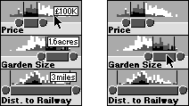
Figure 7: Selection of a single house (by clicking on a data point) and a set of houses (slider)
Zhang and Norman [51] have made a distinction between the external rules (that can be checked perceptually by interaction with the environment) and internal rules (those that must be checked mentally). DIVA focuses on the former whereas ERMIA diagrams tend to describe internal rules.
The combination of three possible levels and two different types of question (object or attribute) provides six possible questions a user might ask i.e. questions about: a single object or attribute, a set of objects or attributes or all of the objects or attributes (denoted as o, a, [o], [a], O, A) . These six classes of questions can be used as a notation to describe users selections and the consequent groupings that are available for comparison in the display.
There are two types of perceptual comparison. Firstly there is comparison of different groupings within a static display (Static Comparison). Secondly the user has the power to interact with the visualization and make changes. In this way they can compare two discrete. It can be useful to further distinguish comparison within an attribute and comparison between attributes as these often involve different operations.

Figure 8 A description of the Attribute Explorer
The central column of figure 8 shows how the user can select a single object (o1 - a house). The consequence of this is that o1's attribute values are highlighted on each of the histograms.
When the display is static, the user can compare the selected house (o1) with the whole set (O) within a particular histogram. Between histograms the user can compare the different values of the selected house (i.e. o1 with o1). Dynamically the user can select one house (o1) and then another (o2) sequentially. This facilitates comparisons of these two houses both within a histogram and between histograms (o1 with o2).
The right column of figure 8 describes how a user can select attribute bins([a1] ) with a slider. Initially a set of attribute bins are selected. The consequence of this selection is the black and dark grey additive encoding described in example G earlier.
Whilst the display is static the user can compare the black objects [ob1], the dark grey objects [odg1] and full set of objects O with each other, within a histogram. Between histograms the black objects distribution on each scale can be compared ([ob1] with [ob1]) and in the same way the dark grey objects distribution on each scale can be compared ([odg1] with [odg1]). If the user adjusts the display dynamically then the user can compare the original black set of objects with the new set of black objects ([ob1] with [ob2]). The same goes for the dark grey objects ([odg1] with [odg2]). This occurs both within and between histograms.
The description allows the identification of the possible comparisons on the display and encourages speculation about additional comparisons that might improve the tool.
The initial salient structure of this display is that the data is grouped by its longitude and latitude attributes (i.e. it is displayed on a map). The user interacts with the system by selecting a set of attribute bins [a] with a slider. The consequence of this selection is that it is added as an extra filter on the data. The resulting data set is displayed as a scatterplot (Figure 9). This means that as the user moves the sliders the data displayed changes.
The table in Figure 9 shows that the the interactive filtering does not facilitate any more perceptual comparison in the static display than the initial salient structure. However when a slider is moved (or a button pressed) the user can compare the effect of the current query result with the previous query ([o1] with [o2]).

Figure 9: The Dynamic Home Finder
If the comparison that a user wants to make is part of the initial salient structure of a visualization the comparison can be immediately seen and requires little work. However if the comparison requires work to be seen (i.e. the user must make a selection) then work is added to the cost. If the comparison requires dynamic rather than static comparisons to be performed then this requires a further cost. Thus the order of cost of knowledge is: Initial Salient Structure < Static Comparison < Dynamic Comparison.
The Dynamic Queries Interface described provides little static information to the user (although more recent implementations do provide more static information). However if one were to add additive encoding to the scatter plot display (and/or the sliders), so that data points that were close to satisfying the user's query were encoded, then this would reduce the cost of knowledge for searching for useful houses.
a) It is important to explicitly represent Input and Output relations. This provides an externalization of the current state of the interaction. This is important if the user is to engage in a dialogue with the visualization.
b) One should also consider these Input/Output relations over time. Both historical and potential information can be invaluable ways to keep up a dialogue with the user. Such representations have not yet been fully exploited
c) Another useful distinction might be between interaction performed by the user and that performed by a community. Chalmers et al [12] has just started exploring the visualization of such data. The growth of the World Wide Web, and the large amounts of communal information it can provide means that such meta data is becoming both available and useful.
d) The importance of exploiting novel forms of interactivity and data was also identified. We can form many rich displays using both indirect manipulation and meta data. I believe we still only have a very limeted understanding of the possibilities available to us.
e) This paper has very much ignored contextual information. Other frameworks might be useful for providing this perspective. For instance, Activity Theory might provide a valuable starting point for describing a visualization in its context of use [29].
This paper has attempted to provide an overview of a new and exciting area. It's main purposes are to encourage others "to explore the space of the possible" [16] and to stimulate discussion. As Green [21] has identified, HCI needs new vocabulary and concepts in order to raise the level of discussion about interfaces. Hopefully some of the descriptions presented here can help with that process.
2. Ahlberg C., Williamson C. and Shneiderman, B. "Dynamic Queries for Information Exploration: An Implementation and Evaluation" Proceedings of CHI'92 pp. 619-626 ACM Press.
3. Becker R.A., Huber P.J., Cleveland W.S. and Wilks A.R. "Dynamic Graphics for Data Analysis", Stat. Science 2, 1987.
4. Bederson B., Hollan J.D., Perlin K., Meyer J., Bacon D. and Furnas G. " Pad++: A Zoomable Graphical Sketchpad for exploring Alternate Interface Physics" Journal of Visual Languages and Computing (1996) 7, pp. 3-31.
5. Benyon D. (1992) "Task analysis and sytem design: the discipline of data" Interacting with Computers 4 (1) 246-249
6. Bertin J. "Graphics and Graphic Information Processing" deGruyter Press, Berlin, 1977.
7. Bier E.A., Stone M.C., Fishkin K., Buxton W., Baudel T. "A Taxonomy of See-Through Tools" in Proceedings of CHI'94 pp. 358-364, ACM Press
8. Brooks, R. "Comparative Task Analysis: An Alternative Direction for Human-Computer Interaction Science" pp. 50- 59, in "Designing Interaction" John M. Carroll (Ed), Cambridge University Press (1991)
9. Card S.K., Mackinlay J.D. and Robertson G.G " The Design Space of Input Devices" Proceedings of CHI'90, pp. 117-124 ACM Press.
10. Card S.K., Pirolli P. and Mackinlay J.D. "The Cost of Knowledge Characteristic Function: Display Evaluation for Direct-walk Dynamic Information Visualizations" Proceedings of CHI'94 ACM Press
11. Casner S. "A Task-Analytic Approach to the Automated Design of Graphic Presentations" ACM Transactions on Graphics 10, (2) pp. 111-151
12. Chalmers M., Ingram R. and Pfranger C. (1996) "Adding Imageability feature to Information Displays" Proceedings of UIST'96 pp
13. Dawkes H., Tweedie L.A. and Spence B. (1996) "VICKI-The Visualisation Construction Kit" in the Proceedings of Advanced Visual Interfaces `96, Gubbio, Italy.
14. Davidson C. "What your database hides away" New Scientist 9th January 1993
15. Draper S. "Display Managers as the Basis for User-Machine Communication" in (Eds) D. Norman and S. Draper User Centered System Design Lawrence Erlbaum Associates
16. Draper, S. "Critical Notice: Activity theory: the new direction for HCI?" IDIOMS (1993) pp. 812-821
17. Eick S.G. "Data Visualization Sliders" UIST'94 November pp. 119-120, ACM Press
18. Eick S.G., Steffen J.L. and Sumner E.E. "SeeSoft (TM) - A Tool for Visualizing Line Oriented Software", IEEE Transactions on Software Engineering, pp. 11-18, 1992.
19. Eisenberg M. "The Thin Glass Line: Designing Interfaces to Algorithms" in Proceedings of CHI 96, ACM Press.
20. Furnas G.W. and Zacks J. "Multitrees: Enriching and Reusing Hierarchical Structure" In Proceedings of CHI'94, ACM Press
21. Green T.R.G. "Cognitive Dimensions of Notations" in A.Sutcliffe and L. Macaulay "People and Computers VI: Proceedings of HCI'89" Nottingham, pp 443-460, Cambridge University Press.
22. Green T.R.G. and Benyon D.R. "The skull beneath the skin: entity-relationship models of information artifacts" Int. J. Human Computer Studies (1996) 44 pp. 801-828
23. Howe D. "Data Analysis for Database Design", Edward Arnold 1983.
24. Inselberg A. "The plane with parallel coordinates", The Visual Computer 1, pp. 69-91, 1985.
25. Keim D.A. and Kriegal H. "VisDB: Database Exploration using Multidimensional Visualization", IEEE Computer Graphics and Applications September, pp. 40-49, 1994.
26. Larkin J.H. and Simon H. A. "Why a Diagram is (Sometimes) worth Ten Thousand Words" Cognitive Science 11 (1987) pp. 65-99
27. Lunzer A. `Reconnaissance: a widely applicable approach encouraging well-informed choices in computer-based tasks.' Ph.D. thesis. TR-1996-4, Department of Computing Science, University of Glasgow, February 1996. 266pp.
28. Mihalisin T., Gawlinski E., Timlin J. and Schwegler J. "Visualizing Scalar Field on an N-dimensional Lattice", Proc. of Visualization 90, IEEE CS Press, pp. 255-262, 1990.
29. Nardi B.A. " Context and Consciousness" MIT Press 1996.
30. Nardi B.A. and Zarmer C.L. "Beyond Models and Metaphors: Visual Formalisms in User Interface Design", Journal of Visual Languages and Computing 4, pp. 5- 33, 1993.
31. Newton C.M. "Graphics: from alpha to omega in data analysis", in Graphical Representation of Multivariate Data, P.C.C. Wang (Ed) Academic Press, pp. 59-92, 1978.
32. Norman D. "The Psychology of Everyday Things" 1988, Basic Books.
33. Norman D.A. "Cognitive Artifacts" pp. 17-38 in "Designing Interaction" John Carroll (Ed), Cambridge Uni. Press (1991)
34.. Rao R. and Card S.K. "The Table Lens", Proceedings of CHI'94, Boston, ACM Press, pp. 318-322, 1994.
35. Robertson, G., Mackinlay J. and Card S.K. "Cone Trees: Animated 3D Visualizations of Hierarchical Information" Proceedings of CHI'91 pp. 189-194 ACM Press
36. Robertson, P.K. "A Methodology for choosing Data Representations" IEEE Computer Graphics and Applications May 1991 pp. 56-67.
37. Simon H.A. "The Sciences of the Artificial" MIT Press 1969
38. Smets G, Gaver W.W., Overbeeke C.J. and Stappers P.J. "Designing in Virtual Reality: Perception-Action Coupling and Form Semantics" Adjunct Proceedings INTERCHI'93.
39. Smith R. "Experiences with the Alternate Reality Kit: An Example of the Tension between Literalism and Magic" in the Proceedings of CHI and GI `87, ACM Press.
40. Spoerri A. "InfoCrystal: A visual tool for Information retrieval" Proceedings of Visualization '93 pp. 150-157.
41. Tukey J. "Exploratory Data Analysis" Reading, MA: Addison Wesley
42. Tweedie L.A. "Interactive Visualization Artifacts: how can abstractions inform design?", People and Computers X : Proc. of HCI'95 Huddersfield, (Eds) Kirby M.A.R., Dix A.J. and Finlay J.E., Cambridge University Press, pp. 247-265, 1995.
43. Tweedie L.A., Spence R., Bhoghal R. and Williams D. "The Attribute Explorer", ACM, Video Proceedings and Conference Companion, CHI'94, pp. 435-436, April 1994.
44. Tweedie L.A., Spence R., Dawkes H. and Su H. "Externalizing Abstract Mathematical Models" Proceedings of CHI 96 pp. 406-412 ACM Press
45. Vellman P. "The DataDesk Manual" Data Description Inc. Ithaca N.Y. 1985
46. Wilkinson L. "Enhancing Scatterplot Matrices" in Survey and Statistical Computing A.Westlake(Ed) Elsevier Science, 1992.
47. Williamson C. and Shneiderman B. "The Dynamic HomeFinder: Evaluating dynamic queries in a real estate information exploration system", ACM, Proceedings SIGIR'92, pp. 339-346, 1992.
48. Young D. and Shneiderman B. "A graphical filter/flow model for Boolean queries: An implementation and experiment" J. of the American Soc. for Information Science 44 (4) pp. 327-339
49. Young F.W, Faldowski R.A. and McFarlane M.M. "Multivariate Statistical Visualization" in C.R. Rao (Ed) Handbook of Statistics Vol. 9, Elsevier Science (1993)
50. Zhang J. "A representational analysis of relational information displays" International Journal of Human Computer Studies, 1996, 45, pp59-74
51. Zhang J. and Norman D.A. "Representations in Distributed Cognitive Tasks", Cognitive Science 18, pp. 87-122, 1994.
|
|