


|
|
We have two main points in the paper: 1) the use of a dial as a primary input device and the reflection of the dial in the look and feel of the user interface provides a new paradigm useful for wearable computers and 2) conceptual integrity is the key to a successful design. Having an overriding design motif enables groups from different disciplines to make the decisions necessary to have a coherent system within a limited time frame. In our case, the realization that the dial was the central organizing motif of our design grew slowly. It was only toward the end of the project that the importance of the dial from a design perspective became apparent.
Figure 1 shows VuMan3 in use in a maintenance application. The use of wearable computers as a personal assistant can be seen from [5]. VuMan3 is a stand alone computer system that is comprised of a processing unit with an integrated input device worn on the body and a commercial head mounted display (the Private Eye.) It was designed by an integrated product team in the Spring of 1994 using a user centered design process [2]. The team was composed both of students for whom the construction of VuMan3 was a class project and permanent staff.
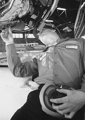 Figure 1: Vuman3 being used in a maintenance context
To recast our comment about conceptual integrity in process terms: there are many stakeholders in the design of a computer system. The designer's task is to determine how to view the technological biases of some stakeholders from the user's perspective and how to accommodate as many stakeholders views as possible. Similarly, the use of an integrated product team does not mean that all disciplines are created equal when the team makes design decisions. It means that the design decisions for all disciplines must be subordinate to the integrity of the design, once the design motif has been developed.
The paper is organized to present our biases going into the design project, how we achieved user input and the constraints under which we operated. We do this by presenting the project chronologically and reflecting on our experiences. We also discuss the particular system that we designed and the results of field testing it.
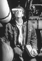
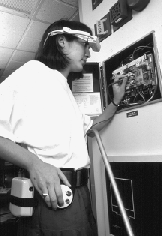

Figure 2: Three earlier generations of wearable computers
This type of technology exploration is very common among research organizations. The purpose is to demonstrate that systems of particular types can be constructed, to understand the technology and the difficulties of construction and to gather informal feedback in opportunistic settings with respect to general impressions of the artifacts created. The expense of a formal usability study is typically not justified since the purpose of the effort is to explore technology and not, at that time, produce functioning products. All of the evaluations of the various wearable computers described in this section were of this informal type and were based on student and visitor feedback given to builders of the system.
The VuMan1 was used to view blueprints. It had two function buttons (used to move left, right, up and down depending on mode) and a mode change button. These buttons were integral to the device. The device, itself, was large and cumbersome but the reaction to the integral buttons was positive and the intuitiveness of the device for its intended purpose was very well received.
The VuMan2 was a much smaller device. It was used to provide a campus tour. A three button selection device was used as the input device. The input device was separated from the computer as a means of allowing experimentation with various input devices. The input device could be held in the hand or mounted on the body. One lesson from this system was the importance of orientation when the input device was mounted on the body. The fingers were often placed on the buttons incorrectly.
The Navigator 1 was a larger device with speech input also used for a campus tour. It had a detachable commercially available trackball as an input device. We were now entering the realm of mouse surrogates. The trackball we used had problems with robustness and size - it was too small. Its main problem, however, was its use during motion. The operator would hold the trackball in their hand and position the cursor with the thumb. Correctly locating the target turned out to be very difficult because the screen was moving and that, in turn, was because the wearer was moving. Furthermore, the device had to be held in the hand, body mounting was not possible.
From these systems and the student and visitor feedback we drew the following lessons that represented our technological biases upon beginning to work with the U.S. Marines:
We were prepared to perform the demonstration in the context of the 1994 Spring semester of a project class that had constructed the prior wearable systems.
This ``look for a task where your technology can show its worth'' is typical. Not only research organizations but product organizations are often in this situation. Research organizations wish to demonstrate their technology, product organizations wish to sell or create technologies from which they can make a profit. In both cases, the designers are constrained by the business purposes of their organizations. The constraint to use a particular technology such as a particular operating system or hardware in turn constrains the design. Some of our constraints were to use wearable technology in a real task, to do this primarily using student labor and within the time of a semester. Some of these constraints were met but the completion time was not.
Our first goal was to understand the maintenance process. When a vehicle arrives at the depot for maintenance, over 600 of its parts are first inspected to determine which parts are defective. The results of this inspection are recorded on a clipboard, the contents of the clipboard are then entered into the maintenance computer system by a different person from the inspector. Once the results have been entered, the necessary parts that are not in stock are ordered, the parts are taken out of inventory and the vehicle is scheduled for repair. Finally, the defective parts on the vehicle are replaced.
Our initial decision was to construct a device that could be useful in both the inspection and the repair tasks but to initially focus on the inspection. The device would be used to record defects discovered during the inspection. In the jargon, the inspection is named a Limited Technical Inspection (LTI). We chose this task for several reasons:
Once we decided to focus on the Limited Technical Inspection task, we made contact with the personnel who performed those tasks. One critical element of doing user centered design is to deal with actual users and not the users' higher level management. We dealt with the actual inspectors as well as their Sergeants. The Sergeants are very experienced at inspections and have the perspective to understand what our technology might do for them. Higher level management has a very abstracted view of the processes being performed and often, these abstractions hide essential details.
We demonstrated VuMan2 to the end users and walked through the vehicle inspection with them. We also walked through the inspection wearing a VuMan2 to determine the constraints that wearing additional equipment might cause. While going through the inspection we made an extensive photographic record - both still and video. We also interviewed the inspectors.
Some of our observations were:
Besides making contact with the personnel who would actually be performing the inspection, we also began integrating them into our product team. We discussed with them the technology and how it worked and solicited ideas about what would work and what the problems were. We also got their feedback about our initial concept. This was important not only to get their input, which was valuable, but to get their buy in to the demonstration. On subsequent visits, we would be able to show them how their ideas were being incorporated into the system. Thus, they began to assume ownership of the result. This transfer of ownership (at least of the ideas) to the end users tends to make them advocates for the technology and to be more tolerant of the inevitable technological problems when they surface.
This last item is very important. The goal of gaining feedback from the users is not only for the information content but also for the assumption of responsibility and ownership. In our case, since user satisfaction was one of the primary measures, we were very conscious of the side effects of our interactions with the end users.
Finally, the device must be comparable to a clipboard in difficulty of use. We interpreted this to mean that training time for the device should be under five minutes.
We visualized having the device operable from different locations on the body. Thus, when the operator was lying on the back, the device would be on the front, when the operator was lying on the stomach, the device would be on the back, and so forth.
In general, this is the method that we use to develop the design: we have several loose concepts, these are developed and analyzed against scenarios of use as a method for understanding them and then the concepts are combined, when appropriate, and refined. It is only when concepts are refined and mock ups constructed that any detailed examination of how well the requirements are being met is appropriate.
Ideally, in the user centered process, the user will see and will give feedback to both the concepts and then the refinement. The distance precluded having user involvement at the initial exploration level.
One suggestion that arose during the concept exploration was that control panels often had dials and that, somehow, the computer system was controlling the inspection. Control panel dials are usually small but this suggestion seemed to have merit.The dial suggestion was not treated as a tremendous breakthrough but merely another concept that was worthy of exploration. The concept exploration phase then focussed on two main concepts for the input device: one was the five button and the other a dial. Pure versions and combinations were explored. Input devices that were rejected for various reasons during this phase included a speech recognizer and various exotic input devices.
At this point, the questions about the dial were related to how to make it usable. The discussions revolved around issues such as: how large should a dial be, what was the amount of rotation necessary to move through a screen, and the number of selection points necessary to perform a particular task, and basically, could a dial be used as the input device.
While the industrial design/mechanical engineering group were examining either buttons or a dial as an input device, the software group was verifying that either input device could be used to support the LTI checklist. A dial is logically equivalent to a tab left and tab right and, thus, if the input could be performed with a dial then it could also be performed with two buttons. The software group proceeded on that basis.
The industrial design/mechanical engineering group during its explorations examined a variety of different sizes and shapes for the dial. Human factors materials [4] were used to get hand measurements. A variety of different possibilities were examined as shown in Figure 3.
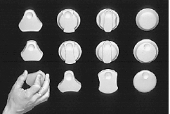 Figure 3: Various dial concepts that were explored
While the various dial concepts were being explored, the base system input concept was being refined. One of the combinations of the original concepts (a dial, a selection button and a mode button) seemed to offer a solution to the robustness, the mobility and the usability problems.
During the exploration of the dial, the observations were made that if the dial was sufficiently large, then gloves could be worn during operation, and the operation of the dial is the same whether the operator is right or left handed and regardless of the position on the body.
The elements were then in place for the second visit to the end users. The concept of the input device and, a version of the software for the VuMan2 were ready for review and it was clear that many of the requirements could be satisfied with a device with those elements. An overall design theme had not yet emerged and in preparation for the visit, a product mock up was constructed (a blockish shape based on the rectangle) and some sketches were made of a more curved shape.
A staff member went through the movements of the LTI wearing the VuMan2 to check for clearances and mobility constraints, especially with the head mounted display.
We held a focus group with the end users. We let them try on the VuMan2 but not operate it to get their reactions to wearing a computer. We then had them look at the storyboard concepts of the VuMan3 and give us feedback. Finally, we had them operate the VuMan2 to get reactions to the software. A screen from the initial software is shown in Figure 4.
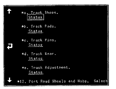 Figure 4: Inital software implementation
One of the concepts we showed them had a knob that kept dirt out of the mechanism and one had a triangular shared grasping portion to facilitate movement of the dial. Both of these were well received by the end users. They liked the finger holes on the dial as a means of orienting their hand.
Note the use we were making of the users at this point. They were a group being used for review of our concepts. We were not using them to generate ideas (at this point) but as critics and givers of feedback. It was also important to keep the users engaged and indicate to them that we were making progress, that they could expect to see an actual working system and that their previous input had been taken into account.
The detailed design of the dial emphasized elements such as the number and volume of the detents (stops) of commercially available dials, the size, shape and placement of the buttons and, finally the relationship of the dial to the housing.
The key housing decisions had to be made in conjunction with the electronics group. The electronics that were going to be used in the VuMan3 would, essentially, determine the size and weight of the final device. The size and weight was primarily determined by the power requirements of the device and this, in turn, was determined by the electronics that were going to be used. One of the early decisions of the electronics group was to use an Intel 386 processor. This decision was driven primarily because of the unknowns associated with uses of the device other than the LTI. The presentation of manuals and graphics likely would be processor intensive and so a more powerful processor than absolutely required was used. The key decision of the electronics group, however, was the decision on the shape of the mother board.
Standard boards are rectangular. This is the standard shape in which a board can be purchased and it allows the maximum flexibility in the placement of components. Placing a large rectangular board inside a housing, however, tends to make the housing large and rectangular. Interactions and discussions between the electronic team led to a board shape as shown in Figure 5. This shape was compatible with the housing being developed by the industrial/mechanical team who had curved the housing to make it better fit the body. This decision was not made easily by the electronics group and there were many spirited discussions over the topic.
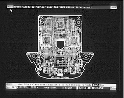 Figure 5: The Mother board used in the VuMan3
Although the concept of a dial as the design motif had not yet been articulated, by default, the dial was beginning to drive the decisions made by the other groups. In order to have a curved design, which was compatible with a large dial, the mother board needed to have a non-standard shape.
We finalized these design elements and proceeded to implementation. The users were, at this point, unaware of our final design. If they had been closer we would have reviewed it with them one more time but both because of distance and the looming end of the semester, such a review was not possible.
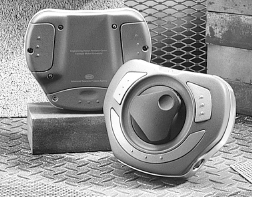 Figure 6: Final physical form of the VuMan3
This design reduced the number of cables to 1 (between the device and the head mounted display). The chosen design had the selection buttons radial around the dial selected by the fingers and the mode button under the thumb. A stop to keep the fingers from coming off the dial was provided by constructing a boot to hold the device. The boot also allowed mounting the device around the belt. It could be shifted from front to back depending on the position of the user and from the left side to the right side depending on whether the user was right or left handed.
The software concept that is compatible with the dial is shown in Figure 7. In the middle of the screen is an image or text that need refinement and around the outside are labels that provide links to further screens or final selections. The cursor is initially over one of the labels and each turn of the dial (clockwise) will move the cursor to the next numbered label. Counterclockwise turns of the dial will move the cursor to the prior label. (The numbers around the outside of Figure 7 are just for the purposes of this paper.)
 Figure 7: Example of circular motif possible with dial.
Future uses of the VuMan3 were intended to support other maintenance activities. The image in Figure 7 could be a blow up diagram of an engine or other mechanical part. The movement of the dial corresponds to moving around the selected links in either a clockwise or counter-clockwise direction. That is, what the users do and what they perceive work together.
From a software perspective, anything in which the contents of a single screen can be represented as a circular list of selectable items is suitable for a dial. Each turn of the dial moves the active element to the next element of the list. Each element of the list can be linked to another screen that is invoked when the list element is selected. This covers checklists, as we will see, as well as hyper-text and labelled diagrams. All of these are suitable applications for a dial input.
From a visual perspective, use of the dial suggests placing selectable items on the outside of the screen and to navigate through them in a circular fashion. Thus, the screen look and feel corresponds to the input device being used and the end user feels as if they are dealing with a single, unified device.
The software was then revised to use this motif. The revised software had several elements:
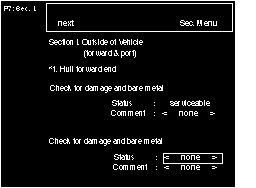 Figure 8: Final user interface.
Note the evolution of our design decisions. The dial was introduced as a concept in one of the groups of the integrated product team. It gradually grew to the point where it began to dominate the look and feel of the physical device. This required the electronics group to modify their design for the mother board. It caused the software to be modified to reflect the physical design decisions and this final result was a new user interface paradigm: circular input and circular visualization.
We observed (video taped) six different inspections. Three with the paper based system and three using the VuMan3. We also interviewed the subjects after they completed the tasks. All of the subjects expressed a high degree of satisfaction with the device and its utility. We met our training time objective by having each subject instruct the next subject in the operation of the device.
Furthermore, a reduction in task time of 40% was achieved. This time does not include the time to actually enter the data into the repair control system because of an incompatibility with the U.S. Marines computer system. The Marines used a 286 based data entry system and the oldest system with which we were able to test was a 386. If this time had been included, the reduction in task time would have been even greater since in other venues we found that data entry takes about an hour with a paper based system and about 2 minutes with a wearable computer.
Figure 9 shows our latest design. This system has multiple possible input devices. One is the dial shown and the other is designed to be used when the dial is not appropriate and uses a circular touchpad as an input device.
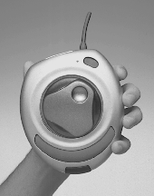 Figure 9: Descendant of VuMan3.
We were also interested in generality and in furthering our agenda of wearable computers. Thus, we not only focussed on the LTI inspection process but also put some thought into the other types of applications for which the device we were constructing could be used.
The use of an integrated product team was central to the results. We had negotiations between the industrial designers and the electronics people that were intensive and emotional. We reflected the industrial design concept of a dial into the user interface. The team was very broad comprising many different engineering disciplines including software as well as industrial and graphic designers. A single concept has to drive the results, however, and that concept then becomes the master of the disciplines. So the electronics team were able to figure out how to construct and populate and different shape board. The user interface team was able to figure out how to reflect the dial in the user interface and so on. Conceptual integrity usually results from a very small number of designers. Thus, there was a large integrated product team but the design concept that ended up permeating the design came from the industrial designers.
2. Norman, D. and Draper, S. ``User Centered Systems Design'', Erbaum, 1986.
3.Siewiorek, D., Smailagic, A. Lee, J.,Tabatabai, A. ``An Interdisciplinary Concurrent Design Methodology as Applied to the Navigator Wearable Computer System'', Journal of Computer and Software Engineering, Vol.2, No.2, 1994.
4. Tillen, Alvin. ``The Measure of Man and Woman'', Dreyfus Associates, 1993.
5. http://lcs.www.media.mit.edu/projects/wearables
|
|